Since her debut in 1959, Barbie has become a global icon, representing more than just a doll but an entire cultural phenomenon. Central to this identity is the Barbie logo, which has undergone several transformations over the decades, each iteration reflecting changing trends, cultural shifts, and the brand’s evolution. This comprehensive guide explores the history of the Barbie logo, highlighting the expert logo design principles that have made it a timeless symbol.
The Birth of Barbie: The Original Logo (1959)
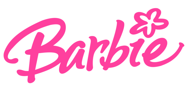
A Classic Script
The original Barbie logo, introduced in 1959, featured a whimsical, cursive script that reflected the fashion-forward and glamorous nature of the doll. The use of a handwritten style gave the logo a personal touch, making Barbie feel like a unique and relatable character for young girls.
Color Scheme
The original logo was often presented in pink, a color that quickly became synonymous with the Barbie brand. The choice of pink was intentional, aligning with the traditional perceptions of femininity and appealing to the target demographic.
Impact
The initial logo set the tone for the brand, establishing Barbie as a stylish and aspirational figure. It was simple yet elegant, capturing the imagination of young girls and laying the foundation for Barbie’s enduring legacy.
The 1970s: A Modern Update
Streamlined Design
In the 1970s, the Barbie logo underwent its first significant update. The script became more streamlined and modern, reflecting the changing times. This redesign aimed to keep Barbie relevant as societal norms and fashion trends evolved.
Consistency in Color
While the typography was modernized, the iconic pink color remained a staple, maintaining brand consistency and ensuring instant recognition.
Cultural Relevance
The 1970s logo update coincided with Barbie’s expanding role as a symbol of modern womanhood. The logo’s sleeker design mirrored the decade’s push towards modernity and progressiveness, aligning Barbie with contemporary values.
The 1980s: Bold and Vibrant
Embracing Boldness
The 1980s brought a new wave of boldness and vibrancy to the Barbie logo. The script became more pronounced and energetic, with a slight slant that added a dynamic feel. This change reflected the bold fashion and cultural trends of the era.
Introducing New Colors
During this period, the logo was often presented in a variety of bright and neon colors, reflecting the vibrant and eclectic styles of the 1980s. This flexibility in color usage allowed Barbie to remain trendy and fashionable.
Enhanced Visibility
The bolder design and vibrant colors enhanced the logo’s visibility, making it stand out on packaging, advertisements, and merchandise. This increased visibility helped strengthen Barbie’s presence in the market.
The 1990s: Returning to Elegance
A Refined Script
In the 1990s, the Barbie logo underwent another transformation, returning to a more elegant and refined script. This redesign aimed to balance the brand’s playful nature with a touch of sophistication.
Consistent Branding
The logo’s color palette returned to the iconic pink, ensuring brand consistency. This decision reinforced Barbie’s identity and kept the brand’s image cohesive across various products and marketing materials.
Nostalgia and Modernity
The 1990s logo managed to evoke a sense of nostalgia while remaining modern and relevant. This balance helped Barbie appeal to both longtime fans and a new generation of children.
The 2000s: Sleek and Contemporary
Minimalist Approach
Entering the 2000s, the Barbie logo adopted a sleeker and more contemporary look. The script was simplified, and the overall design became more minimalist. This change reflected broader design trends favoring simplicity and clean lines.
Versatility in Usage
The minimalist design increased the logo’s versatility, allowing it to be effectively used across various digital and print platforms. This adaptability was crucial in maintaining Barbie’s relevance in an increasingly digital world.
Reinforcing the Brand
Despite the simplified design, the logo continued to convey Barbie’s core values of fashion, fun, and empowerment. The enduring pink color ensured brand continuity and recognition.
The 2010s: Embracing Diversity
A Modern Classic
In the 2010s, the Barbie logo retained its sleek and minimalist design but began to emphasize diversity and inclusion. The brand’s campaigns and product lines expanded to reflect a broader range of ethnicities, body types, and career roles.
Inclusive Branding
The logo’s consistent design provided a stable foundation as Barbie embraced a more inclusive identity. This period saw the brand emphasizing messages of empowerment and self-expression, aligning the logo with contemporary values.
Cultural Impact
The modern classic logo became a symbol of Barbie’s commitment to evolving with the times and promoting positive social change. It represented a brand that was not just about fashion and glamour but also about celebrating individuality and diversity.
The Role of Expert Logo Design in Barbie’s Success
Professionalism and Quality
The evolution of the Barbie logo highlights the importance of professional and high-quality design. Each iteration of the logo has been carefully crafted to reflect the brand’s identity and adapt to changing trends while maintaining consistency and recognition.
Customization and Personalization
Expert logo designers have worked closely with the Barbie brand to create logos that are highly customized and personalized. Understanding the target audience and cultural context has been crucial in ensuring that each logo resonates with fans and stays relevant.
Versatility and Scalability
A professionally designed logo is versatile and scalable, and the Barbie logo is a prime example. From toy packaging to digital marketing, the logo has been used across various mediums without losing its impact. This versatility has been essential in maintaining Barbie’s presence in a dynamic market.
The Impact of the Barbie Logo on Brand Perception
Creating a Memorable Impression
A well-designed logo leaves a lasting impression, and the Barbie logo is no exception. It serves as a visual anchor that fans associate with the brand’s values of fun, fashion, and empowerment. Each iteration of the logo has contributed to Barbie’s strong brand recall and loyalty.
Enhancing Credibility and Trust
A polished and professional logo enhances the brand’s credibility and trustworthiness. The consistent quality of the Barbie logo has signaled to consumers that the brand is committed to excellence, reinforcing its reputation as a leader in the toy industry.
Communicating Brand Values
Through thoughtful design, the Barbie logo effectively communicates the brand’s values. Whether emphasizing fashion, fun, or empowerment, each version of the logo has aligned with Barbie’s evolving identity and cultural relevance.
Tips for Creating an Effective Logo
Focus on Simplicity
The success of the Barbie logo underscores the importance of simplicity in logo design. A simple, clean design is easier to recognize and remember, making it more effective in establishing brand identity. Focus on key elements that represent the brand and avoid unnecessary complexity.
Ensure Versatility
A logo should be versatile enough to be used across various platforms and mediums. Test the design in different contexts to ensure it maintains its impact and clarity. A versatile logo ensures consistent brand recognition and adaptability.
Reflect Brand Values
A logo should accurately reflect the brand’s values and mission. Consider the message you want to convey and choose design elements that support that message. The Barbie logo effectively communicates the brand’s commitment to fashion, fun, and empowerment.
Test and Refine
The design process should involve feedback and refinement to ensure the final logo aligns with the brand’s vision and goals. Present initial designs to stakeholders, gather input, and make necessary adjustments. This iterative process ensures the logo meets the expectations of both the brand and its audience.
Conclusion
The Barbie logo’s evolution is a testament to expert logo design and its role in building a powerful and enduring brand identity. Each iteration of the logo has reflected the changing cultural landscape and the brand’s commitment to staying relevant while maintaining its core values.
Investing in professional logo design services ensures that a brand’s logo is well-crafted, versatile, and impactful. By focusing on simplicity, reflecting brand values, and incorporating feedback, brands can create logos that stand the test of time and become iconic symbols of their identity.
In a world where branding is increasingly important, the Barbie logo serves as an inspiring example of how expert logo design can elevate a brand to global recognition and cultural significance. With the expertise of professional designers, brands can create logos that are not only visually stunning but also rich in meaning and history.
